

This article was last updated on August 19, 2024, to add sections on Flexbox Accessibility Considerations and Best Practices for Performance Optimization.
Introduction
TailwindCSS is a robust CSS framework that provides numerous utility classes for layout, sizing, colors, typography, etc. One of the most powerful capabilities Tailwind provides is responsive variants of utility classes for all screen sizes. Tailwind also supports variants for an element's states like hover, focus, active, and so on.
CSS Flexbox is supported by TailwindCSS with Flex classes that are initiated with flex and further styled with intuitive and easy to remember placement classes like justify-start, justify-center, items-start, items-center, and the like. Layout direction is manipulated using classes named flex-col and flex-row.
In this post, we will play with Tailwind Flex classes to build a simple React navbar that initially has its menu vertically stacked in screens smaller than md, and hoists it horizontally to the top at larger screens. Since we are using Tailwind to move the nav menu up, with Flex rows it is just Tailzup!
We'll employ a mobile-first approach, so we'll be starting with using flex-direction: "column" with flex-col class and then at md apply flex-direction: "row" with flex-row. We'll use Flex order modifiers such as order-last to change the order of navbar items. We'll also be growing items using flex-{n} classes.
We'll start with a collapsible React navbar that already comes in a collapsed state with the necessary spacing and sizing implemented so that we can focus on the use of Tailwind Flex classes in this article.
Before starting, though, let's talk about the prerequisites that need to be managed for getting hands-on with Tailwind Flex.
Steps we'll cover:
- Starter Files
- Styling a Navbar with TailwindCSS classes
- Flexbox Accessibility Considerations
- Best Practices for Performance Optimization
- Avoid Layout Shifts
- Use Tailwind's JIT (Just-In-Time) Mode
- Optimize for Critical Rendering Path
- Lazy Load Non-essential Content
- PurgeCSS with Tailwind
Prerequisites
You must first have Node.js to initialize a React App. You can get it from here.
Follow these steps to start a React App with TailwindCSS:
- From your terminal, go to a folder of your choice. Create a React App with CRA and open it in your code editor:
npx create-react-app flex-navbar
code flex-navbar
- Install TailwindCSS and initialize the
tailwind.config.jsfile:
npm install -D tailwindcss postcss autoprefixer
npx tailwindcss init -p
- Configure template paths:
/** @type {import('tailwindcss').Config} */
module.exports = {
  content: [
    "./src/**/*.{js,jsx,ts,tsx}",
  ],
  theme: {
    extend: {},
  },
  plugins: [],
}
- Add Tailwind layers to your CSS file. For this project, I have moved mine to
src/styles/styles.css:
/* CSS reset or normalizer code */

@tailwind base;
@tailwind components;
@tailwind utilities;

/* TailwindCSS styles */
It is important that the Tailwind directives are added towards the top of your CSS file before any other TailwindCSS classes are used.
- Run the compile script for TailwindCSS, with the
--watchflag:
npx tailwindcss -i ./src/styles/styles.css -o ./public/styles/styles.css --watch
With this, TailwindCSS will compile styles in ./src/styles/styles.css and put it in the ./public/styles/styles.css folder. It is important that it keeps running in order to instantly compile newly added classes.
- Link the CSS file to
./public/index.htmlfile:
<link href="./styles/styles.css" rel="stylesheet" />
If you run into any hurdle, please check out how to initialize a React app with create-react-app (CRA) for TailwindCSS from here.
With the development environment set up, let's now get our starter files prepared.
Starter Files
To begin working, our App.tsx file should look like this:
import React from "react";
import Navbar from "./components/Navbar";

function App() {
  return (
    <div className="App">
      <Navbar />
      <main>{/*Lorem stuff here*/}</main>
    </div>
  );
}

export default App;
Please feel free to clean up all other imports and markups.
We want to focus on the <Navbar /> component.
<Navbar /> Component
The <Navbar /> component initially looks like this:
Show Navbar styles
import React, { useState } from "react";
import { Avatar, HamburgerIcon, SearchIcon, TailzupLogo } from "./../icons";
import TailzupLogo from "../images/tailzup-logo.png";

const Navbar = () => {
  const [isMobileMenuOpen, setIsMobileMenuOpen] = useState(false);
  const menuHidden = !isMobileMenuOpen ? "hidden md:block" : "";
  return (
    <nav className="navbar">
      <div id="brand-wrapper" className="nav-wrapper">
        <a className="brand" href="/">
          <img src={TailzupLogo} width={180} height={62} alt="tailzup-logo" />
        </a>
      </div>
      <div
        className={`${menuHidden} border-t border-slate-500 text-amber-50 transition-all duration-1000 ease-in-out md:border-none`}
      >
        <div id="items" className="my-2">
          <div className="left mx-2 p-2">
            <input
              className="text-input"
              type="email"
              placeholder="Find donald trump or something..."
            />
            <SearchIcon />
          </div>
          <div>
            <ul id="right" className="">
              <li className="nav-item">
                <a href="/">
                  <Avatar />
                </a>
              </li>
              <li className="nav-item">
                <a className="nav-link" href="/">
                  Home
                </a>
              </li>
              <li className="nav-item">
                <a className="nav-link" href="/">
                  Friends
                </a>
              </li>
              <li className="nav-item">
                <a className="nav-link" href="/">
                  Messages
                </a>
              </li>
            </ul>
          </div>
        </div>
      </div>
      <HamburgerIcon
        isMobileMenuOpen={isMobileMenuOpen}
        setIsMobileMenuOpen={setIsMobileMenuOpen}
      />
    </nav>
  );
};

export default Navbar;
If you examine, you can see that the display and hiding logic of the vertical menu is already implemented using isMobileMenuOpen state. We also have all the spacing, typography and color styles completed with navbar, nav-wrapper, brand, and text-input classes composed from necessary TailwindCSS utility classes. You can see what's going on in src/styles/styles.css file for the details.
Images
We are using the following imported image for our logo:
import TailzupLogo from "../images/tailzup-logo.png";
You can download it from here and add it to the specified directory.

Styles
The CSS file we are using looks like the one below. Please copy over all the styles and place them inside src/styles/styles.css:
Show CSS styles
@tailwind base;
@tailwind components;
@tailwind utilities;

:root {
  --primary-color: rgb(223, 232, 247);
  --secondary-color: rgb(182, 76, 27);
  --grayscale: rgb(226, 218, 218);
  --friendly: green;
  --neutral: blue;
  --warning: yellow;
  --danger: crimson;
  --forbidden: black;
}

* {
  margin: 0;
  padding: 0;
  box-sizing: border-box;
}

body {
  min-width: 450px;
}

.navbar {
  @apply fixed mx-auto h-auto w-full bg-slate-600 px-2;
}

.nav-wrapper {
  @apply h-14 w-full bg-slate-600;
}

.brand {
  max-width: 12rem;
  color: var(--primary-color);
  @apply mx-2 block py-2 text-4xl;
}

.nav-item {
  @apply mx-2 w-full rounded p-1 transition-all hover:scale-105 hover:shadow hover:backdrop-brightness-125 lg:mx-8 lg:w-auto;
}

.nav-link {
  @apply p-1 text-center;
}

.text-input {
  @apply rounded-l border px-2 py-0.5 text-slate-800;
}

.avatar {
  width: 2rem;
  height: 2rem;
  color: whitesmoke;
}

.tailzup-logo {
  width: 4rem;
  height: 4rem;
}

.icon {
  width: 1.5rem;
  height: 1.5rem;
  color: whitesmoke;
}
Icons
We have some icons in src/components/icons folder. They are mainly the JSX markup of Heroicons. Please copy them over and import them as necessary.
Show Icons
import React from "react";

export const HamburgerIcon = ({ isMobileMenuOpen, setIsMobileMenuOpen }) => {
  return (
    <div
      className={`absolute right-4 top-3 rounded border border-slate-500 p-1 text-slate-500 hover:bg-slate-500 hover:text-slate-300 md:hidden`}
      onClick={() => setIsMobileMenuOpen(!isMobileMenuOpen)}
    >
      <a href="/">
        <svg
          xmlns="http://www.w3.org/2000/svg"
          fill="none"
          viewBox="0 0 24 24"
          strokeWidth={1.5}
          stroke="currentColor"
          className="h-6 w-6"
        >
          <path
            strokeLinecap="round"
            strokeLinejoin="round"
            d="M3.75 5.25h16.5m-16.5 4.5h16.5m-16.5 4.5h16.5m-16.5 4.5h16.5"
          />
        </svg>
      </a>
    </div>
  );
};

export const Avatar = () => {
  return (
    <a href="/">
      <svg
        xmlns="http://www.w3.org/2000/svg"
        fill="none"
        viewBox="0 0 24 24"
        strokeWidth={1.5}
        stroke="currentColor"
        className="avatar"
      >
        <path
          strokeLinecap="round"
          strokeLinejoin="round"
          d="M15.75 6a3.75 3.75 0 11-7.5 0 3.75 3.75 0 017.5 0zM4.501 20.118a7.5 7.5 0 0114.998 0A17.933 17.933 0 0112 21.75c-2.676 0-5.216-.584-7.499-1.632z"
        />
      </svg>
    </a>
  );
};

export const SearchIcon = () => {
  return (
    <button
      className="duration-50 rounded-r border px-2 py-0.5 transition ease-in-out hover:rounded-r hover:border-slate-400 hover:bg-slate-500"
      href="/"
    >
      <svg
        xmlns="http://www.w3.org/2000/svg"
        fill="none"
        viewBox="0 0 24 24"
        strokeWidth={1.5}
        stroke="currentColor"
        className="icon"
      >
        <path
          strokeLinecap="round"
          strokeLinejoin="round"
          d="M21 21l-5.197-5.197m0 0A7.5 7.5 0 105.196 5.196a7.5 7.5 0 0010.607 10.607z"
        />
      </svg>
    </button>
  );
};
The icons also come with necessary TailwindCSS styles. You can copy and paste them directly and use them in your navbar if you feel the need to.
Alright, with everything now set on the stage, let's try running the app:
npm run start
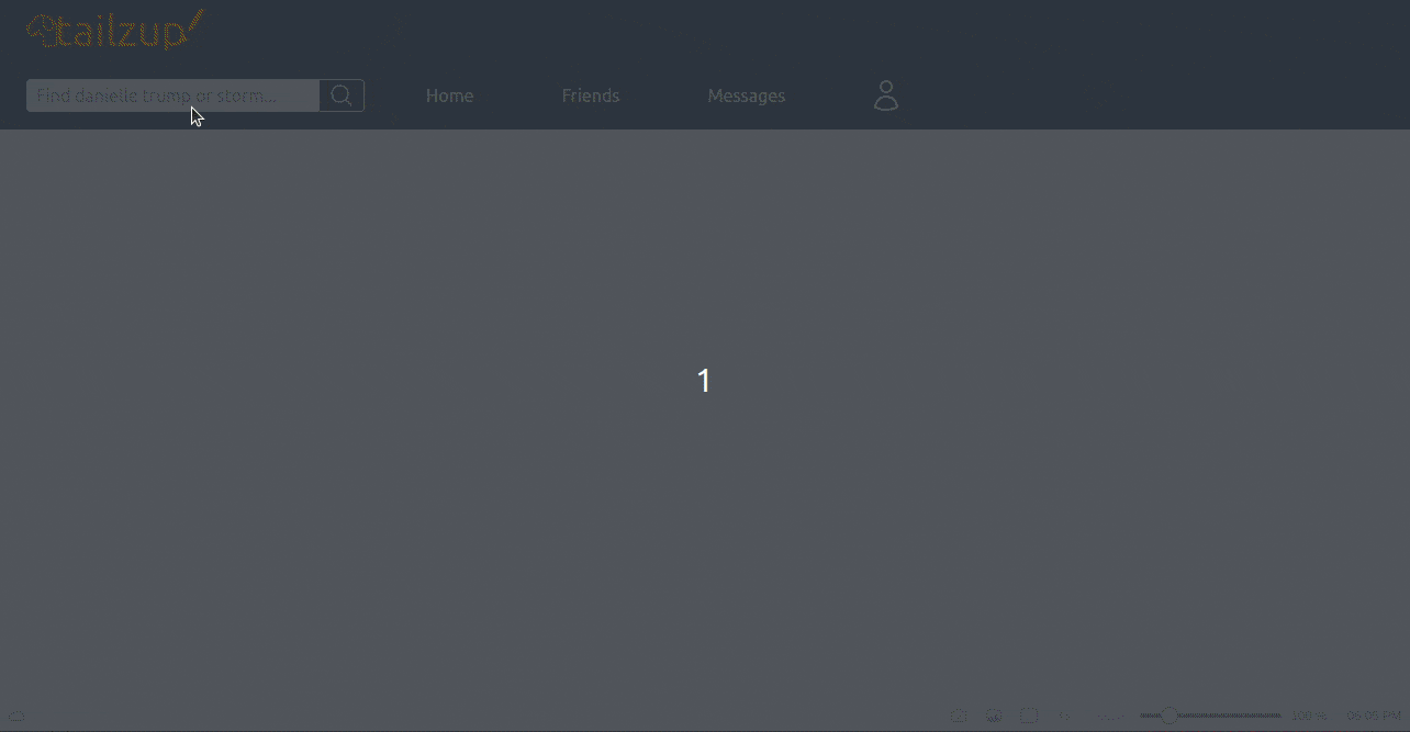
You can see a vertical menu and a toggle button at a screen size less than md. And the toggle button is functioning properly:
The menu items in <Navbar /> are not yet following flex formatting, as all the div's and the unordered list are forming Block Formatting Contexts. This is because the <Navbar /> component does not have any flex styling yet.
So, let's start flexing the navbar with TailwindCSS Flex classes.
Styling a Navbar with TailwindCSS classes
We'll go inside out, as it is easier to manage inner flex containers and then combine container siblings up the HTML tree.
Nav Items with Tailwind Flex
We'll apply a mobile-first approach to the <ul> list and its items. They make up the main navigation links. And we want to start with flex columns on smaller screens and then go horizontal at md. While in column layout, we want the items to be justified and aligned to the top-left. This is achieved as default without any flex placing classes:
<div>
  <ul
    id= "right"
    className="flex flex-col md:flex-row md:justify-start md:items-center"
  >
    <li className= "nav-item md:order-last" >
      <a href="/">
        <Avatar />
      </a>
    </li>
    <li className="nav-item">
      <a className="nav-link" href="/">
        Home
      </a>
    </li>
    <li className="nav-item">
      <a className="nav-link" href="/">
        Friends
      </a>
    </li>
    <li className="nav-item">
      <a className="nav-link" href="/">
        Messages
      </a>
    </li>
  </ul>
</div>
At md, with md:flex-row md:justify-start md:items-center, we are turning the items horizontally, justified to the start, and vertically positioned to the center.
Ordering List Items with Tailwind Flex
Notice, the <Avatar /> item's <li> element is the first item on smaller screens, and we moved its order to last with md:order-last. On screens larger than md it's showing at the end of the horizontal navbar.
Search Bar
Next, we look at the sibling of the container of the list we just "flexed" - the parent that houses the search bar. We first want the search bar input and icon to be flexed together, centered horizontally and vertically at all times. So:
<div
  className="left mx-2 flex items-center justify-center p-2"
>
  <input
    className="text-input"
    type="email"
    placeholder="Find danielle trump or sth..."
  />
  <SearchIcon />
</div>
Then, we want to correctly position the search bar and the nav list items. We want the search bar and list items stacked vertically from top-left on smaller screens, i.e., while in flex-col direction. And on screens larger than md, we want them to go horizontal, positioned justified from the start, and vertically centered. So, on the parent container with id=" items":
<div
  id="items"
  className="my-2 flex flex-col items-start justify-start md:flex-row md:items-center md:justify-start"
>
  <div
    className="left order-last mx-2 flex items-center justify-center p-2 md:order-none"
  >
    <input
      className="text-input"
      type="email"
      placeholder="Find danield trump or st..."
    />
    <SearchIcon />
  </div>
  <div>
    <ul
      id="right"
      className="flex flex-col md:flex-row md:items-center md:justify-start"
    >
      <li className="nav-item md:order-last">
        <a href="/">
          <Avatar />
        </a>
      </li>
      <li className="nav-item">
        <a className="nav-link" href="/">
          Home
        </a>
      </li>
      <li className="nav-item">
        <a className="nav-link" href="/">
          Friends
        </a>
      </li>
      <li className="nav-item">
        <a className="nav-link" href="/">
          Messages
        </a>
      </li>
    </ul>
  </div>
</div>
Notice we are applying flex order again with Tailwind Flex order classes. With order-last md:order-none on the search bar container, we are placing it at the bottom of the vertical stack on smaller screens, and by removing it on md and up, we are moving it back to the first position.
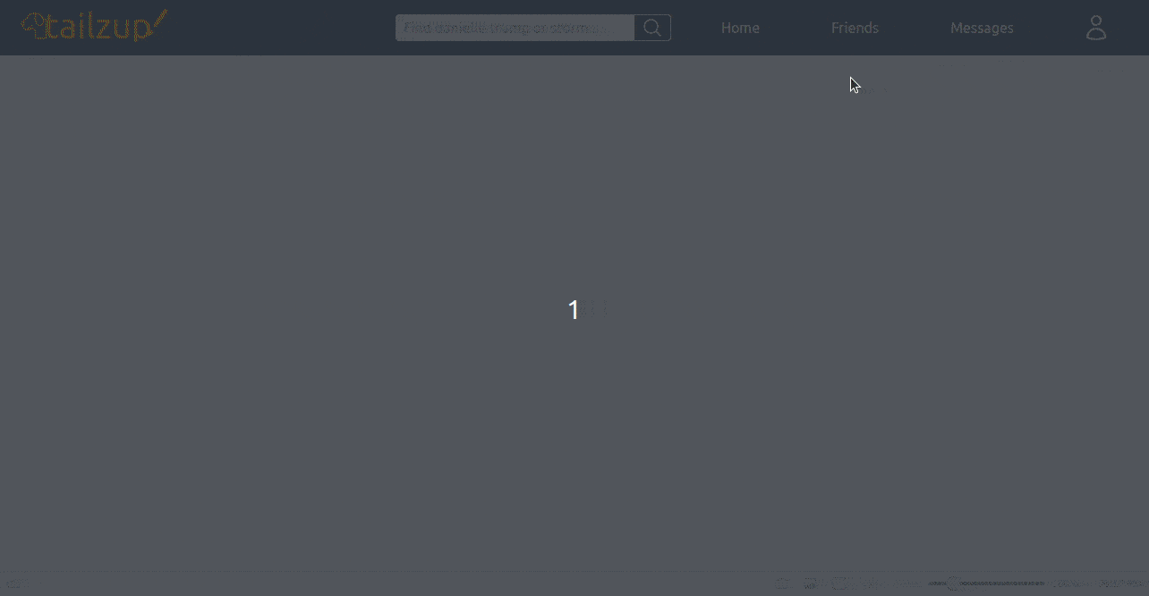
So, with these changes, we have been able to achieve a good shape for the vertical navbar. The navbar looks almost complete, and it can now strongly flex its muscles back and forth in the horizontal position:
We need to now fix things with the brand item, which should be on the left of the other items on larger screens.
Positioning Navbar Logo with Tailwind Flex
Before we work on the parent <nav>, let's make sure all elements inside the id= "brand-wrapper" are always centered horizontally and vertically.
<div
  id= "brand-wrapper"
  className="nav-wrapper flex justify-start items-center flex-1 self-start"
>
  <a className="brand" href="/">
    <img src={TailzupLogo} width={180} height={62} alt="tailzup-logo" />
  </a>
</div>
Notice the flex-1 class. It is related to the flex of the nav element. We are making the brand-wrapper div grow to empty spaces all the time.
And now, in the parent nav element, for screens larger than md, let's make the navbar items on the right become horizontal with the brand item on the left:
Show code
<nav
  className="navbar flex flex-col justify-start md:flex-row md:items-center md:justify-between"
>
  <div className="nav-wrapper flex flex-1 items-center justify-start self-start">
    <a className="brand" href="/">
      <img src={TailzupLogo} width={180} height={62} alt="tailzup-logo" />
    </a>
  </div>
  <div
    className={`${menuHidden} border-t border-slate-500 text-amber-50 transition-all duration-1000 ease-in-out md:border-none`}
  >
    <div
      id="items"
      className="my-2 flex flex-col items-start justify-start md:flex-row md:items-center md:justify-start"
    >
      <div className="left order-last mx-2 flex items-center justify-center p-2 md:order-none">
        <input
          className="text-input"
          type="email"
          placeholder="Find danielle trump or stormy..."
        />
        <SearchIcon />
      </div>
      <div>
        <ul
          id="right"
          className="flex flex-col md:flex-row md:items-center md:justify-start"
        >
          <li className="nav-item md:order-last">
            <a href="/">
              <Avatar />
            </a>
          </li>
          <li className="nav-item">
            <a className="nav-link" href="/">
              Home
            </a>
          </li>
          <li className="nav-item">
            <a className="nav-link" href="/">
              Friends
            </a>
          </li>
          <li className="nav-item">
            <a className="nav-link" href="/">
              Messages
            </a>
          </li>
        </ul>
      </div>
    </div>
  </div>
  <HamburgerIcon
    isMobileMenuOpen={isMobileMenuOpen}
    setIsMobileMenuOpen={setIsMobileMenuOpen}
  />
</nav>
With flex flex-col justify-start md:flex-row md:justify-between md:items-start on nav element, we are placing the brand items stacked on top of other items on smaller screens, and then md and up, they are horizontally spaced between and centered vertically.
So, with this Tailwind Flex power, we have a pretty neat React responsive navbar we can use on any webpage:
And the final <Navbar /> component looks like this:
Show Navbar
import React, { useState } from "react";
import { Avatar, HamburgerIcon, SearchIcon } from "./icons";
import TailzupLogo from "../images/tailzup-logo.png";

const Navbar = () => {
  const [isMobileMenuOpen, setIsMobileMenuOpen] = useState(false);
  const isMenuHidden = !isMobileMenuOpen ? "hidden md:block" : "";

  return (
    <nav className=" navbar flex flex-col justify-start md:flex-row md:items-center md:justify-between">
      <div
        id="brand-wrapper"
        className="nav-wrapper flex flex-1 flex-nowrap items-center justify-start self-start
"
      >
        <a className="brand" href="/">
          <img src={TailzupLogo} width={180} height={62} alt="tailzup-logo" />
        </a>
      </div>
      <div
        className={`${isMenuHidden} border-t border-slate-500 text-amber-50 transition-all duration-1000 ease-in-out md:border-none`}
      >
        <div
          id="items"
          className="my-2 flex flex-col items-start justify-start md:flex-row md:items-center md:justify-start"
        >
          <div className="left order-last mx-2 flex items-center justify-center p-2 md:order-none">
            <input
              className="text-input"
              type="email"
              placeholder="Find all trump or storm his estates..."
            />
            <SearchIcon />
          </div>
          <div>
            <ul
              id="right"
              className="flex flex-col md:flex-row md:items-center md:justify-start"
            >
              <li className="nav-item md:order-last">
                <a href="/">
                  <Avatar />
                </a>
              </li>
              <li className="nav-item">
                <a className="nav-link" href="/">
                  Home
                </a>
              </li>
              <li className="nav-item">
                <a className="nav-link" href="/">
                  Friends
                </a>
              </li>
              <li className="nav-item">
                <a className="nav-link" href="/">
                  Messages
                </a>
              </li>
            </ul>
          </div>
        </div>
      </div>
      <HamburgerIcon
        isMobileMenuOpen={isMobileMenuOpen}
        setIsMobileMenuOpen={setIsMobileMenuOpen}
      />
    </nav>
  );
};

export default Navbar;
Flexbox Accessibility Considerations
I've been working on making our Flexbox layouts more accessible, and I wanted to share some best practices that I found.
Keyboard Navigation
Make sure that all the elements in a Flexbox container are reachable by keyboard navigation, with an order of tabbing that is logical and moves through the interface in a meaningful way. We'll do this by managing the tabindex attribute such that users move logically through our interface.
<div class="flex-container" tabindex="0">
  <div class="flex-item" tabindex="0">
    Item 1
  </div>
  <div class="flex-item" tabindex="0">
    Item 2
  </div>
  <div class="flex-item" tabindex="0">
    Item 3
  </div>
</div>
Focus Management
It is good to handle the focus states and more than that, when layouts are dynamic and content may change its place, it's best to manage focus through JavaScript or utilities like the Tailwind ones related to focus, in order to highlight elements that get focused.
<button class="focus:outline-none focus:ring-2 focus:ring-blue-500">
  Click Me
</button>
ARIA Roles and Labels
For better compatibility with screen readers, the use of appropriate ARIA roles is needed—such as role="navigation" for navbars—and labeling interactive elements by using aria-label to describe their purpose. This will help users understand the layout structure better.
<nav aria-label="Main Navigation" role="navigation">
  <ul class="flex">
    <li>
      <a href="/" aria-label="Home">
        Home
      </a>
    </li>
    <li>
      <a href="/about" aria-label="About Us">
        About
      </a>
    </li>
    <li>
      <a href="/contact" aria-label="Contact Us">
        Contact
      </a>
    </li>
  </ul>
</nav>
Responsive Considerations
As our Flexbox layout will change for sure according to device width, we must ensure that such change remains accessible. For example: If a menu is going to collapse in smaller screens, make sure there's always a way to expose it clearly, either by a button or link, which will then be marked up with the aria-expanded attribute.
<button aria-expanded="false" aria-controls="menu" class="md:hidden">
    Menu
</button>
<nav id="menu" class="hidden md:flex">
    <!-- menu items here -->
</nav>
Best Practices for Performance Optimization
I was thinking about squeezing the most performance out of our project since we are using a lot of Flexbox and TailwindCSS. Here are a few tips and tricks that may help us keep our layout fast and responsive:
Avoid Layout Shifts
One thing we must be careful of is layout shifts, which can occur when our elements move around on the page while it is loading. We should give explicit sizes to our Flexbox containers and items. For example:
.flex-item {
  width: 100px;
  height: 100px;
}
Sizing definitions inform the browser how to assign space, which reduces the likelihood of unexpected shifts.
Use Tailwind's JIT (Just-In-Time) Mode
The JIT mode from Tailwind can really help boost performance, as we only generate CSS that is actually in use. That potentially shrinks down the size of the CSS files, hence boosting the loading time of your pages. You enable it by tweaking your tailwind.config.js file:
module.exports = {
  mode: "jit",
  // The rest of your Tailwind config
};
Optimize for Critical Rendering Path
Load the critical content first above-the-fold. In other words, don't be render blocking for any CSS or JS file above-the-fold. Some ways to do this is to directly inline critical CSS in the HTML:
<style>
  .critical-class {
    /* Critical CSS here */
  }
</style>
By doing so, the browser ensures that critical content gets loaded first, hence improving the perceived load time.
Lazy Load Non-essential Content
Use lazy loading for images and any non-essential content so that they load only once in view. This reduces the initial load time and saves bandwidth. Here is how we can do it:
<img src="image.jpg" loading="lazy" alt="Description" />
This attribute ensures that the image is loaded only when it is about to become visible.
PurgeCSS with Tailwind
Lastly, PurgeCSS allows us to discard any unused CSS classes in our codebase, making the file smaller. Using PurgeCSS in our Tailwind setup becomes easy through configuration in the tailwind.config.js:
module.exports = {
  purge: ["./src/**/*.{js,jsx,ts,tsx}", "./public/index.html"],
  // the rest of your Tailwind config
};
These steps should help us optimize our layout and improve performances across the board. Let me know if you have any other ideas or maybe we should try implementing these!
Summary
In this post, we used Tailwind Flex classes to build a collapsible, responsive React navbar. The navbar hides the menu on mobile screens and can be toggled via clicking on a double cheese hamburger button. It hoists up to a horizontal bar after md.
We started off with the layout and element sizes already styled with relevant Tailwind utilities and the mobile menu implemented. We then gradually applied intuitive Tailwind Flex classes to determine the flex directions for our target break points with flex-col and flex-row. We applied placement flex classes such as justify-center, justify-start, items-center, items-start, self-start, etc., to position flex items to intended places for each breakpoint. We also changed orders of a couple of flex items using order-{n} classes. We also used the flex-{n} class to grow our logo wrapper to available spaces.